Hello, fellow Nukapedians! I come to you today with hopes of changing both our current background, and possibly even our current banner.
- As you can see here, this is what we have as our background and banner, right now:
 File:Nukapedia - Current Banner.png
So why am I wanting to change what we have now, when we've been using the same theme for so long? (Background - Years/Banner - Over half a year)
All of my points are purely my own personal opinion.
- Nukapedia seems to rely on bright and bland colours. This is not what Fallout is about. Fallout relies on dark and dreary colours; focusing on the destruction and rubble of the old world.
- Our current background is quite frankly as spartan and tasteless as they come. I've always been bothered with it, and I finally decided to make my own before the one we have now gives me eye cancer.
- I quite like our current banner. However, with darker colours like I'm suggesting, it will end up sticking out like a sore thumb.
Without further ado, I would like to present you with the themes that I've finished and that I am thoroughly pleased with:
I am working on more themes. Please check on this page regularly for possible updates.


As I'm trying to keep the best interests of this wiki in my heart, it would be utterly unfair of me to not include as many options as possible when considering any significant changes to Nukapedia such as this. Because of this, I would also like to include a theme that our very own Administrator Gunny has introduced.


This is Energy X's background proposal:

For any of you whom are interested in the original banner we made before having to butcher it to get it to 150kb, here you go:

Comments
- I would love to hear some constructive criticism! If you feel like something should be changed, let me know! If you have a certain theme you'd like for me to tackle, well then, let me know! Thanks for reading everyone, and I hope our work is to your liking!
 Some Assembly Required!
The font doesn't look right to me... It looks too 1980's rather than 50's.... Otherwise I like it. Agent c (talk) 19:18, September 1, 2012 (UTC)
- When I was using this font, I rather liked it because it reminded me of the style the Enclave or BoS would use. However, I understand your concern, and I am still actively searching for alternative fonts. I'll update this forum with another example banner if I find another appropriate font. Some Assembly Required!
Damn! Looks really great leon. My only concern is the vault logo. I'm not sure what we should do if we keep this. Maybe another contest? ![]() "THE WABBAJACK!" 19:23, September 1, 2012 (UTC)
"THE WABBAJACK!" 19:23, September 1, 2012 (UTC)
- Why is that a concern? Some Assembly Required!
The one we have now won't really fit in with the first theme. It would with the second though. The vault door is more of a "The Vualt" kind of thing though, isn't it? That's my concern. ![]() "THE WABBAJACK!" 19:29, September 1, 2012 (UTC)
"THE WABBAJACK!" 19:29, September 1, 2012 (UTC)
- Ausir doesn't have exclusive rights to Vault doors. ;) In any case, I put special care into the addition of a Vault door that doesn't look anything like The Vault's. Thanks for your feedback! And I'm glad that you like our designs! Some Assembly Required!
I know I told you earlier, Leon, but personally I don't think Fallout focuses on grimdark grim darkness of dreary doom - I think it has a larger focus on rebuilding the world, life resurfacing, the development and structure of societies and the positives and negatives of the human nature - Fallout 2 and Fallout: New Vegas displays this clearest. I'd personally prefer some happier colours, although muted and "apocalyptic". Hugs ![]() "Say 'ello to my little friend!"
"Say 'ello to my little friend!"
- I just created a theme I think you'll love, then. Keep an eye out for my next update! Should be in about 2 minutes. Some Assembly Required!
- Just added it in. Hope it's to your liking. Some Assembly Required!
- Just added it in. Hope it's to your liking.
The theme I cooked up is just a tool for me to learn more about applying .css to the site. It'll change quite a bit as I mess with learn thing. Anyone is welcome to use the .css code if they want, but I wouldn't say it's even remotely ready to be considered as a real theme for the site to go to. Thanks for putting it up there, Leon, but I reckon folks who are much better at graphic design can do a better job. The Gunny ![]() 20:28, September 1, 2012 (UTC)
20:28, September 1, 2012 (UTC)
- Well, I like what you've come up with, so far. A desert-esque theme certainly fits the Fallout bill. If you want me to take it down, just let me know. But if you really would like this as an option, then I'll definitely keep it up. Just let me know when you update it, and I will do accordingly! Some Assembly Required!
- No, that's fine. If anyone wants to try it out, it's a working .css you can copy. See the directions here: User_blog:The_Gunny/Gunny's_personal_wiki_theme. Since I'll update my .css from time to time, you may want to keep up with the blog. The Gunny 20:51, September 1, 2012 (UTC)
- No, that's fine. If anyone wants to try it out, it's a working .css you can copy. See the directions here: User_blog:The_Gunny/Gunny's_personal_wiki_theme. Since I'll update my .css from time to time, you may want to keep up with the blog. The Gunny
I'm not really digging the first one so much, Gunny's is pretty good. I'm pretty pleased with the one we currently have.--![]()
![]() 20:49, September 1, 2012 (UTC)
20:49, September 1, 2012 (UTC)
- I have to agree. While it was good enough in my opinion to put up here once I had a final product, it's definitely the one I like the least, at the moment. Some Assembly Required!
Can't say I'm fond of the dark background on the pages, it strains the eyes a bit. White is always the way to go behind text IMO. Limmiegirl ![]() Talk! ♪ 20:54, September 1, 2012 (UTC)
Talk! ♪ 20:54, September 1, 2012 (UTC)
- Personally, I wouldn't really agree with this. In response to the dark background, the text is made a brighter white to improve readability. It's actually easier to read for me than to have a white background with black text. After asking around and showing examples to friends on here and family here at home, (A couple who have very bad eyesight, as it runs on both sides of my family.) no one has ever complained about my themes being hard on the eyes. If a user actually finds these themes hard on the eyes and mentions it here, then I will see about creating a much lighter theme choice. Some Assembly Required!
- IDK if it's just me or not, but white-on-black is just intolerable. Unless a scheme is black-on-white I can't support it regardless of any other merit :/ 176.9.209.113 04:23, September 2, 2012 (UTC)
Well, I like them both. I also like the background we have now. I think the brown one you posted was nice, if I had to choose. ![]()
![]() 23:46, September 1, 2012 (UTC)
23:46, September 1, 2012 (UTC)
While I'm not against modification of the theme, I have a few gripes and preferences:
- I think that the text should be black-on-white, or otherwise extremely close to that; I feel that most other variations are unprofessional.
- I don't feel that that font is appropriate for a nuclear apocalypse. It says "Gears of War" to me- in fact, it might be the Gears of War font.
- The Vault-door-like logo looks very cool, but this site is no longer the Vault, and I don't think that should be used.
- I think that logos with transparent backgrounds (like our current logo) are cleaner, because of the way they blend in with the upper bar.
- I quite like the second of the three backgrounds.
![]()
![]() 23:59, September 1, 2012 (UTC)
23:59, September 1, 2012 (UTC)
- I would like to contest your points:
- Whether something looks professional is a matter of personal perspective. For instance, I think black on white is just as professional looking as white on black. Others feel differently, I understand that, and thus I feel this is not a legitimate matter. If you personally don't feel as if you like my choice, this is fine. But saying that it is not professional is a matter of bias. I hope you understand.
- You're right. It's the Jacinto font I'm using. It doesn't really matter. I chose it because it reminds me of the stylings the Enclave and BoS use. Whether the font is appropriate or not is another matter of personal perspective. For instance, the font is almost identical to what we already currently use here. There is minimal changes, with the exception of interior design for each letter.
- This one really annoys me. I understand why you feel the way you do for your other points presented here, but I do not like the suggestion that I should be artistically stifled just because our predecessors had something similar. And when I say similar, I mean that by barely. I took pains to make sure my banner looked nothing like The Vault's logo.
- Like I said, I like our current banner, as well. However, I need to modify my banners for a symbiotic relationship with the background. Hence, a transparent background doesn't look as good for mine. I've tried, and it looked a lot worse.
- Thank you very much, I'm quite happy with it, as well. Thank you for your criticism, and while I contested them all, I will still take them into account with the other projects I'm working on. Some Assembly Required!
Understood. I have no other points at this moment, but I want to highlight my use of "I think", "I feel", and so on. I understand that everything I've said is a matter of bias, which is why I did not use absolutes. I am not, by any means, saying that my points should be beyond reproach, because no one's opinions should shy out of reach of criticism. What I am saying is that I don't hold my perspective to be some objective metric of judgment. ![]()
![]() 00:55, September 2, 2012 (UTC)
00:55, September 2, 2012 (UTC)
- Sorry if I came across as overly-blunt. I think I took what you said a little more roughly after reading your third point. I really do appreciate your criticism though, and I will be taking it into my consensus for new designs. I admit to having trouble making a lighter coloured theme that can take advantage of black text on white. I'll keep working at it. Some Assembly Required!
- No worries, mate. And no matter what I say, that Vault Door remains kickass awesome looking. 03:21, September 2, 2012 (UTC)
- No worries, mate. And no matter what I say, that Vault Door remains kickass awesome looking.
(←)
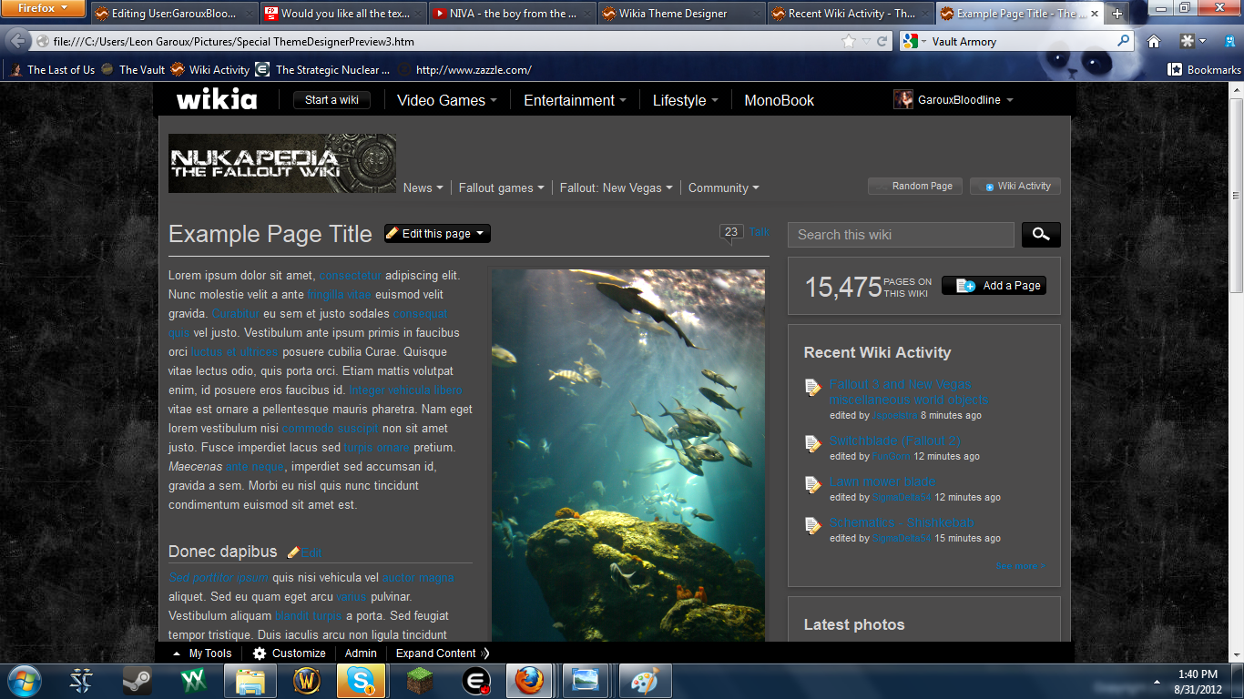
I can see you did you spent time and effort in the new background and logo. Especially impressed by that Vault door. Like you say, it's nothing near the old Vault logo. I'd say the first examples two look rather well, third one has too little color difference between outside banner and the inside. I am worried though about readability with changing from white background/black lettering to dark background/light lettering. I'm pretty sure the one we have now will always have the best readability. Reading from your images looks pretty difficult and besides that, I don't see an example with infoboxes. How would that look? And I still very much like the tiled broken light green banner we have now. We may have had it a long time, but it's for a reason it has lasted that long. It's so easy on the eyes (Bethesda has it too) and I'm not bored by it. I can edit for hours and not get strain on my eyes. Ok, you say the current design doesn't have the dark Fallout feel to it, but Scarface got me thinking about that and I don't think it's really needed and the visitors don't mind is my guess. They will probably prefer the ease of reading information. I know what we have now and it's working well, so I'm very cautious to major appearance changes. If you can I still would like to see how it looks with infoboxes and you can show us a few more examples, but as said, I'm not convinced yet. Gunny's banner isn't too bad either but has a bit too much contrast and personally I'm not crazy about the desert look. Jspoel ![]() 01:11, September 2, 2012 (UTC)
01:11, September 2, 2012 (UTC)
- I'm still working at getting those extra examples for you. I already have the designer wiki made up, but I'm still having to go through the process of migrating the templates needed to create further example pages. I will try my best to have those made up by tonight. If not by tonight, I don't have much to do tomorrow, so I should be done by then, no matter what. Some Assembly Required!
Maybe you can paint a bottle cup (insead of 42) in the center of that vault door?--Theodorico (talk) 02:21, September 2, 2012 (UTC)
- How funny that you should mention that. Using a bottlecap in the center was my original idea, but for some reason, I couldn't get the damn thing to look right. (Nor could I find a proper colour scheme to fit the Vault door behind it.) Some Assembly Required!
- How about coloring the whole door in red/crimson? Like, whole door is a bottlecap? --Theodorico (talk) 02:34, September 2, 2012 (UTC)
- That's a pretty good idea, if I can make what I have in my head. Maybe instead of Crimson, I can make it more of a Sunburst Cherry colour. I'll see if I can come up with something good tonight. Some Assembly Required!
- That's a pretty good idea, if I can make what I have in my head. Maybe instead of Crimson, I can make it more of a Sunburst Cherry colour. I'll see if I can come up with something good tonight.
- How about coloring the whole door in red/crimson? Like, whole door is a bottlecap? --Theodorico (talk) 02:34, September 2, 2012 (UTC)
I like all of what has been offered & I like what we have now as fine to.
- OK, I vote ~ the one with the vault door
I like the banner, and I like theme #1. ~ Toci ~ Go ahead, make my day. 05:39, September 3, 2012 (UTC)
Yes, this is what I've been waiting for. The first background is the one you should go with, and the vault door is a nice touch. However, I'm sure some don't like the grittiness that this theme brings. For what is seems, our background is still representing Fallout 3, with the Green streaks. If the First option isn't picked, then the desert background with original symbol would be preferable.--![]() A Safe People is a Strong People! 15:14, September 4, 2012 (UTC)
A Safe People is a Strong People! 15:14, September 4, 2012 (UTC)
- How is our current background "representing Fallout 3"? --Skire (talk) 15:36, September 4, 2012 (UTC)
- Green texture? To refrase myself, It shares the color palette as Fallout 3, and Fallout: New Vegas' dusty orange color would make more sense, since majority of hte games are set in the west coast desert.-- A Safe People is a Strong People! 16:20, September 4, 2012 (UTC)
- Green texture? To refrase myself, It shares the color palette as Fallout 3, and Fallout: New Vegas' dusty orange color would make more sense, since majority of hte games are set in the west coast desert.--
First background suits the vault door, and is my preferred choice. As opposed to the second which doesn't seem very metallic, with metallic textures fitting also with the door. The current background is rather bleh, though only due to what it's mixed with. It suited the prior logo, the colours were similar, and it suits out current green theme. In terms of current logo, oranges and browns don't really fit with a green theme at all, IMO.
The banner on it's own could fit with the existing background with a little tweaking of the background colour, but since we've been presented with better examples of a background. In terms of Gunny's design, the background and colour scheme is ore suited to our existing logo, though I'm not particularly fond of the white text as the infobox title, it looks rather bright on the background. If it was a block colour background, it'd remove this brightness. Overall, like background #1 the best out of three, and dig the logo/banner. Gunny's background suits the current logo but the infobox colours could perhaps do with some tweaking. --![]() Talk 15:40, September 4, 2012 (UTC)
Talk 15:40, September 4, 2012 (UTC)
I vote for the secondary option. Much more pleasing to the tunnel visioned eye.--Eden2012 (talk) 10:47, September 8, 2012 (UTC)
I have to agree with Limmiegirl, the white text on a grey background is hard on my eyes and trying to read the blue links on the grey background is even worse =/ I really like Gunny's theme idea, but I don't think that that theme would be right for a Fallout series wiki. To my eye, the green in the current theme works well to represent the Fallout series since it's close to the green in the character sheet backgrounds from Fallout 1 and 2 as well as close to the default PipBoy green from Fallout 3. IMO, the orange/amber colors you see in New Vegas' PipBoy color scheme don't really match the other games well, so it seems weird to go with that in a wiki that's for the entire series. Librarymouse (talk) 14:46, September 13, 2012 (UTC)
Front page Improvement...
I've been experimenting with adding a slider for each of the 4 main games to the front page template. You can see a slightly mangled version of the front page here that shows it in effect. It would need different graphics selected as the strech and crop of the box art doesnt seem to work for it as is, and we may have problems come F4 (the documentation suggests only 4 images will work), but I think it adds something dynamic and graphical to the front page, plus the space under the slider would seem to fit an extra couple of (cut) games. I like the effect of something big and graphical there, but aren't sure this is it. Any suggestions on getting a similar concept on the front page? Agent c (talk) 21:30, September 5, 2012 (UTC)
If the "Extras" is to much to do
Well to be honest I am happy with the background we have. Why force a change? If it is not broke.....
![]() SaintPain→ Look for me Dec 22 Y'all know what I'm say'n. 22:41, September 5, 2012 (UTC)
SaintPain→ Look for me Dec 22 Y'all know what I'm say'n. 22:41, September 5, 2012 (UTC)
It would be nice if you could some how salvage the logo shown under extras. If the resolution is to high maybe you could adjust it. Either way, nice work on all of them. speaking for myself, I will be OK with what ever you folks decide even if that means keeping it the same.
![]() SaintPain→ Look for me Dec 22 Y'all know what I'm say'n. 02:31, September 8, 2012 (UTC)
SaintPain→ Look for me Dec 22 Y'all know what I'm say'n. 02:31, September 8, 2012 (UTC)