| This forum page has been archived. Please do not make any further edits unless they are for maintenance purposes. |
Hi Folks,
There's been some talk recently on the positioning of the regular "feature blogs" (News/Hole/NFRPG/Polls etc) and how they detract from the positioning of Fallout 4 news on the front page. I've banged my two brain cells together and come up with a proposal on a few changes.
In looking at this, I've had the following in my mind
- Although the community features and other "fun" parts of the wiki are an important (and perhaps increasingly so) section of the site, the main anchor of this place is the wiki itself, and getting information to those who need it.
- The "Features" tend to be very popular, and are effective at drawing repeat traffic... Lets face it, no matter how good our pages on The Hub or Rivet City are, they aren't pages you're going to come back and read every month. The hole and polls however do have a very dedicated following that do just that.
- When Fallout 4 News hits, we need to ensure that it is not being drowned out by the features.
So without further ado... Here is a hacked-up proposal for a few changes to the front page:
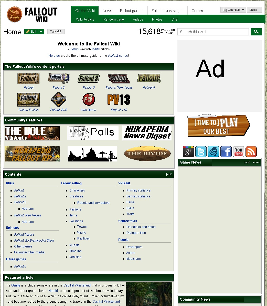
The changes are made up of two main features.
- The one you've probably noticed first is the additon of imaged links to the features on the left.
- This is positioned as such to ensure that these popular pages remain "above the fold" on the front page, without detracting from the positioning of newsblogs.
- Each These would link to a blogroll for that particular feature.
- The positioning of The Polls, the News Digest, and the Character Poll (The Hole, and its off season replacement - coming soon) would be permenent to reflect they are our permenent weekly features.
- Obviously these images are placeholders, hence why they look a bit ugly.
- The lower line would be available for rotation... I'm not suire if the Role-Play is taking a break after the boss fight, The Apprentice is seasonal and will be twice a month this year. The Divide of course is on a long hiatus. We could also mix in Chat, and the Forums (and consider a third line if we're including the latter).
- When Fallout 4 news hits, a specific link to a Fallout 4 news blog should be put in - this would be particularly useful for when Wiki uses "long" ads on the right.
- Additionaly the Moose is a candidate for a rotating spot as its occasional. "Official blogs" and other one-offs can also be rotated in and out.
- On the right, there are now two blogrolls
- The first blogroll is for Proper news, and has the two most recent items added into the News category. The only sanctioned regular blog to use the News category would be the News Digest. Other breaking news would also appear in Category news.
- The second blogroll is for community news. This would be used for the remaining sanctioned blogs, and could also be used for project promotion, one off official blogs, etc.
- Because this is so far down, its likely many wont read it, neccesitating the "Features" section on the left.
- I've also worded the top intro a bit different to try and make better use of the space.
I must stress that this is a mock-up. It will require templates to be created or modified for each section.
I now open the floor to comments and suggestions. Agent c (talk) 16:02, February 11, 2013 (UTC)
Comments[]
Nice work. Since the main page is the most viewed page, would it be good to make a special image to insert on the borders (an example is this user page)? Energy X ![]() 18:40, February 11, 2013 (UTC)
18:40, February 11, 2013 (UTC)
Looks great Chad. I'm all for everything proposed. --The Old World Relics (talk/blog/contributions) 18:58, February 11, 2013 (UTC)
Sounds good. Although I can't remember the last time I've looked at the main page... My bookmark goes to the RC. --Skire (talk) 19:18, February 11, 2013 (UTC)
Brilliant Chad, I have no qualms or opposition to any of that :)--TwoBearsHigh-Fiving ![]() 19:20, February 11, 2013 (UTC)
19:20, February 11, 2013 (UTC)
I like it. It keeps the community content easy to navigate to and maintains the important game content news (of which I am sure there will be more in the near future). My only question is this: When linking to each community activity (The Hole, Polls, etc.) would you simply link to the most recent page, or to a roster list of the previous pages as well, with a focus on the most recent? ![]() nihil novi sub sole 20:09, February 11, 2013 (UTC)
nihil novi sub sole 20:09, February 11, 2013 (UTC)
I like it, except I don't see the point behind keeping the community blog-roll if we're doing the features section. ![]()
![]() 20:48, February 11, 2013 (UTC)
20:48, February 11, 2013 (UTC)
Just in response
- A follower: We could do it either way. Creating a page that just contains a certain feature that auto updates is easy... The only problem with linking to to that list is that it then requires a second click to interact with the blog itself and potentially see all the content, the harder/longer you make people go for content, the more likely you are to lose them on the way. With linking to a direct page, we avoid that potential loss of viewer, but at the cost of someone having to manually update something (probably a redirect or template page as DG/Neko don't have access to edit the front page direct) every time they post... I know I'm a bit forgetful at that.
- Stars - it serves a few purposes. First for us regulars when on the front we can scroll down quick to see if when the last feature update was - the portal-style links wouldn't do that. There may also be one off blogs that don't warrant a feature link but can be included there. Also with things "changing" on the front page every few days from the Community section it makes this place look like things are happening - a wiki with a stale news section can seem quite dead, even when there is a lot of action below the surface... Agent c (talk) 21:56, February 11, 2013 (UTC)
Good, I like it. I have actually been wanting this change to happen for awhile now. Over at the Call of Duty Wikia they have the same system implemented and I think it looks and works out great. Great job. ट्रेलरपार्कप्रिमाते टॉक पेज 08:05, February 12, 2013 (UTC)
I would probably go with the second option, then. Makes more sense. I kind of agree with Stars, the blog roll seems a bit pointless to include as well, plus it might screw up the layout of the page or get pushed all the way down near the bottom by the Fallout 4 news roll. ![]() nihil novi sub sole 22:57, February 12, 2013 (UTC)
nihil novi sub sole 22:57, February 12, 2013 (UTC)
- The Fallout 4 News roll would be limited to 2 items for the forseeable future, rather then 5; this leaves in the existing space at least 3 for community features below. There would be no detremental effect to the front page as the remainder of that column (beyond the Wasteland wiki link that would be retained) is white space anyway. Agent c (talk) 23:05, February 12, 2013 (UTC)
- Alright, no more objections from me. Clearly this has been planned well and all variables taken into consideration. You have my support.
 nihil novi sub sole 21:13, February 13, 2013 (UTC)
- Alright, no more objections from me. Clearly this has been planned well and all variables taken into consideration. You have my support.
Looks great to me. ---bleep196- (talk) 15:29, February 13, 2013 (UTC)
Looks like a good idea to me, and the proposed change looks good. Richie9999 (talk) 22:13, February 13, 2013 (UTC)
A little distinction will be perfect. Our main page needs a major overhaul, anyways. This will be a good step in the right direction. ![]() Some Assembly Required! 22:18, February 13, 2013 (UTC)
Some Assembly Required! 22:18, February 13, 2013 (UTC)
Good. TheMcChicken (talk) 07:04, March 18, 2013 (UTC)
Moving Forward[]
Seems like a good response so far. What I'll try to do over the next week or so is nail down the template for the middle section... Given the Moose is going weekly I'll consider maybe a 3 line variant, but I think that might be too overpowering... In that I'll liase with DG, Leon and Neko (to see what he's doing after the current NFRPG season, if it's going to take a rest or run again) to get that done. If theres no objection to me doing it, I'll put everything together for a week or so's trial after that... After which we can either go to a vote, or if theres no controversy perhaps declare consensus. Agent c (talk) 22:51, February 13, 2013 (UTC)
- Looks ok to me. We needed a change on the front page anyway, this is a good idea and consistent with other wikis. I'd leave it 2 lines, otherwise it takes up to much space and pushes the overview below it down too much. If I understand it correctly when you click on an image, they go to the relevant category? Maybe we can split the image in 2 buttonlinks (at least for the top rank); 1 to the most recent blog and 1 to the category. Game news at the top seems a bit premature, switch places for now with community news I think. Jspoel 23:35, February 13, 2013 (UTC)
WIP[]
| Community Features | ||||||||||||
|---|---|---|---|---|---|---|---|---|---|---|---|---|
|

- As we get labels up for the News, Polls, Moose, NFRPG, "Character vote" and Apprentice this should instamatically update after they're put on the template. Size here is 175x45. From my eyeball, we might be able to spare an extra 20px or so each perhaps... Agent c (talk) 21:06, February 14, 2013 (UTC)
- Dimensions look fine to me. I was thinking maybe you can add some color to the Polls, News Digest and Apprentice image and get rid of too much white. Or maybe make them transparent. Jspoel 22:14, February 14, 2013 (UTC)
- Dimensions look fine to me. I was thinking maybe you can add some color to the Polls, News Digest and Apprentice image and get rid of too much white. Or maybe make them transparent. Jspoel
- Definately... Agent c (talk) 00:36, February 15, 2013 (UTC)
- I like it, but I think the blank space between the rows is a little large. Maybe try 175x60? nihil novi sub sole 06:40, February 15, 2013 (UTC)
- I agree. While the blank space itself isn't an issue, it means we're wasting the possibility of making the banners larger.
Limmiegirl Talk! ♪ 14:04, February 16, 2013 (UTC)
- I agree. While the blank space itself isn't an issue, it means we're wasting the possibility of making the banners larger.
- I like it, but I think the blank space between the rows is a little large. Maybe try 175x60?
Width now 180. Height in the bottom row now 65 (top row 45 for comparison). The major concern I have at this size is they are taller than the game logos on the front page. Agent c (talk) 14:16, February 16, 2013 (UTC)
- Would increasing the height of the gamelogos mess up the line arrangement? If not we could consider increasing them as well. But even so, I don't think it's too much an issue if they're smaller, they're already at the top so they're still prominent in the page.
Limmiegirl Talk! ♪ 14:25, February 16, 2013 (UTC)
- The old width of 175px was fine for me. Adding 5px to it doesn't make that much difference. The height of the bottom row of the feature images looks at bit too much increased. Game logos are 60px in height, that's the max for the feature images also I think. We shouldn't push the Content box down too much. Jspoel 15:04, February 16, 2013 (UTC)
- The old width of 175px was fine for me. Adding 5px to it doesn't make that much difference. The height of the bottom row of the feature images looks at bit too much increased. Game logos are 60px in height, that's the max for the feature images also I think. We shouldn't push the Content box down too much. Jspoel
- Consider this just a minor caveat. Permanent navigation thumbnails for recent-content-driven sections gets dangerous. In sum: it removes the air of newness and liveliness on the front page of the site (for all a new visitor knows, there will have been no new posts in those sections since the release of New Vegas). I think it should be taken into consideration that, after awhile (if there's no game news) that the "Game News" feed will ONLY be populated with Agent c's weekly updates. This will give the News Feed the appearance of one, dutiful, lonely hermit updating the site during the game's downtime. It's a marketing fact that people like their News Feeds to have diverse, constantly new content. As is, when I visit the site (thrice a week probably) there's almost always something new in the news section, posted by multiple people. I can't tell you how important it is for visitors to feel like there is a team of people participating in a site's upkeep.
- The suggested permanent sections represented by corresponding navigation thumbnails will cut down on that vibe drastically (in my opinion). Person of Refinement (talk) 23:46, February 16, 2013 (UTC)
- One more thing: you're proposing 14 (or more!) navigable thumbnails in the relative center of the page. I propose that you'll lose clicks that way due to a combination of 'banner blindness' and the law of 'too many choices.' In terms of web standards and ease of navigation, the current layout (in my opinion) is optimal. If anything, I'd try putting the current News Feed where you're proposing putting the thumbnail table, and having each new entry have its own little, related picture (like a real news site's center page). Person of Refinement (talk) 23:58, February 16, 2013 (UTC)
- I see your point on the news feed... To balance that I'm only planning 2 entries in "game news", and immediatley below that will be the 3 most recent community news.
- The idea for more dynamic front section sounds interesting, but I'm not sure if thats really practical with wikicode... I think we'd be looking for a custom pic and manually editing it every time.... Anyone know another way? Agent c (talk) 00:17, February 17, 2013 (UTC)
Front Blog Page changeover[]
For a trial period, I've changed over the front page. At the moment I have it as per J's suggestion that the community features are above the news. Presuming we keep with this, the idea is we mix them around when we start getting game news.
In that vein, I've also added code for a "Breaking news" blogroll. This is currently commented out, with the idea that we "Activate" it when there is a major announcement. It just requires the <!-- --> to be removed to turn on, and something put into the breaking news category.
In order to prevent duplication, from now on, features such as the Polls, the RP, the Apprentice, etc should only be added in the Community news category. Agent c (talk) 21:35, March 15, 2013 (UTC)
- Why aren't your news digests in the community news section? They're in the game news section pushed way down, while they are important and should be seen when the main page is opened. Digests are community news aren't they? The game news is for game related news, so in a way that will very likely be news about Fallout 4 to come. Do we need a separate breaking news section? Don't think so. It can be in the game news. Jspoel 22:47, March 15, 2013 (UTC)
- I thought the news digests, as at the moment are everything would go in plain news (which is half the reason why I planned it for 2 spots, and the top slot). Breaking is hidden normally, but its for stuff that its urgent we get to the top, and feature out. We can play with this a bit still before we settle on anything and/or revert it all back if it doesn't work. Agent c (talk) 23:03, March 15, 2013 (UTC)
In response to complaints, I've put the news blog back on top, but with just one item in that section (the most recent news) with the idea that this section could be extended during game launch periods. I'm thinking this all might need further study. Agent c (talk) 17:26, April 1, 2013 (UTC)
On a different subject...[]
I know the colour is something comes up every now and then... How do feel about the possibility of Vault Tec blue instead of Pipboy Green? Agent c (talk) 18:24, February 16, 2013 (UTC)
- Personally, I feel it would be best if they were all the same colour on the front page. So if you were to make one the blue, I'd prefer all as blue then. But overall I think the green would try most into the rest of the wiki (articles and whatnot) so best to keep everything green on the front page. --The Old World Relics (talk/blog/contributions) 19:12, February 16, 2013 (UTC)
- Oh, my bad too for misunderstanding. In that case, I'd still stick with the green as green is sinuous in my opinion with Pip-Boys and therefore Fallout where as the blue my not be a totally obvious as it's tie with Fallout. Honestly I didn't even know Vault-Tec's colour was blue :P --The Old World Relics (talk/blog/contributions) 19:42, February 16, 2013 (UTC)
- True true. I guess I over-looked that. Anyways, something inside me still says keep the Green. Maybe that's my colourblindness kicking in and me seeing the blue as more as a purple... --The Old World Relics (talk/blog/contributions) 19:50, February 16, 2013 (UTC)
- Blue is a psychologically passive color. That's a fact and, in my opinion, is a pretty vanilla choice. There's no nuclear urgency to blue. Blue is calm water. A quiet sky. A passive vault dweller sipping purified water. I get what you're driving at, Agent c, but it also lacks context. A blue-hued theme simply isn't Fallouty enough (one could make an equally applicable argument for any repeating, plot-involved color in the game). Contextually speaking, all of the game logos (and in-game palettes) are predominantly red, green and brown, which should be the driving consideration behind the wiki color scheme. Going forward I believe the scheme should unequivocally reflect the logo (and in-game) palette of Fallout 4 (or New Vegas 2). Person of Refinement (talk) 23:29, February 16, 2013 (UTC)
- That's deep man. 23:47, February 16, 2013 (UTC)
- That's deep man.
- While I'm not adverse to small changes to the site look, we did decide to wait until we had some more information about FO4 before making any real changes. The Gunny 00:29, February 20, 2013 (UTC)
- While I'm not adverse to small changes to the site look, we did decide to wait until we had some more information about FO4 before making any real changes. The Gunny
If I remember right, blue is the standard wikia border color. So at the point we would kinda just blend with the others in my opinion. But I think Gunny has a good point on waiting until we have a tad more info on FO4.--Kingclyde (talk) 22:38, March 16, 2013 (UTC)